The surfperch hotel
OVerview
Located in the heart of a quintessential California surf community, the Surfperch Hotel provides a unique hospitality experience near the world-famous Maverick’s surf break in Half Moon Bay. Well seasoned surfers and modern day jet setters trade stories of travel, exploration and epic waves in the bohemian lobby, while the sounds of powerful waves thunder in the distance.
solutions
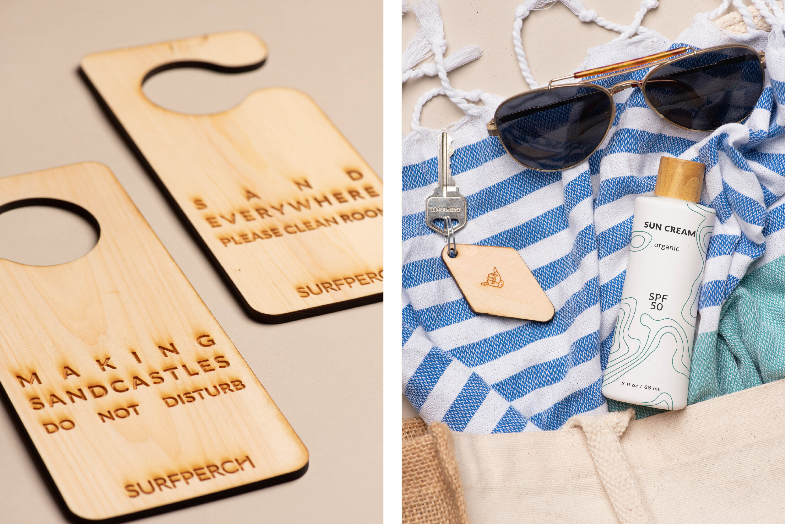
As a hotel dedicated to ocean mindfulness, the Surfperch has focused on minimizing hotel waste. Without sacrificing style, most plastic and paper products have been replaced by reusable materials including glass, driftwood and recycled paper. Sea-foam green was chosen as the signature color of the Surfperch Hotel as it represents the ever-changing hues of the ocean’s surface. The illustrated topographic pattern represents the unique geography that has brought surfers from around the globe to ride multi-story waves in Half Moon Bay. The dominate font for the Surfperch is a san-serif font called Lato, which is Polish for summer. Lato combined with the secondary font, Pt Mono, creates a clean and minimalistic look that can be easily used across all marketing collateral. The minimal color palette and vintage inspired fonts communicate the high-end simplicity and eco-friendly values of the Surfperch Hotel.
Category
Branding
Industry
Hospitality
keywords
Serene
Relaxed
Eco-Friendly


